- Introduction & Syllabus
- 1. Front End Fundamentals
- 2. Object-Oriented Javascript
- 3. Project #1
- 4. Ruby
- 5. Full Stack Sinatra
- 6. Project #2
-
7.
Ruby on Rails
- 7.1. Developer Workflow
- 7.2. Digital Ocean/PaaS
- 7.3. Digital Ocean Lab
- 7.4. Building a webserver
- 7.5. Getting started with Rails
- 7.6. Rails Model Attributes
- 7.7. Rails File Structure
- 7.8. Sinatra vs Rails
- 7.9. Rails Generate Lab
- 7.10. Day 1 - After Hours
- 7.11. Rails Form Helpers
- 7.12. Rails Form Helpers Lab
- 7.13. Authentication
- 7.14. Videos & Source Code
- 8. Underscore.js
- 9. Backbone.js
- 10. Project #3
- 11. Node, Express.js, MongoDB
- 12. Angular.js & TDD
- 13. Portfolio Project
- Published with GitBook
Bootstrap
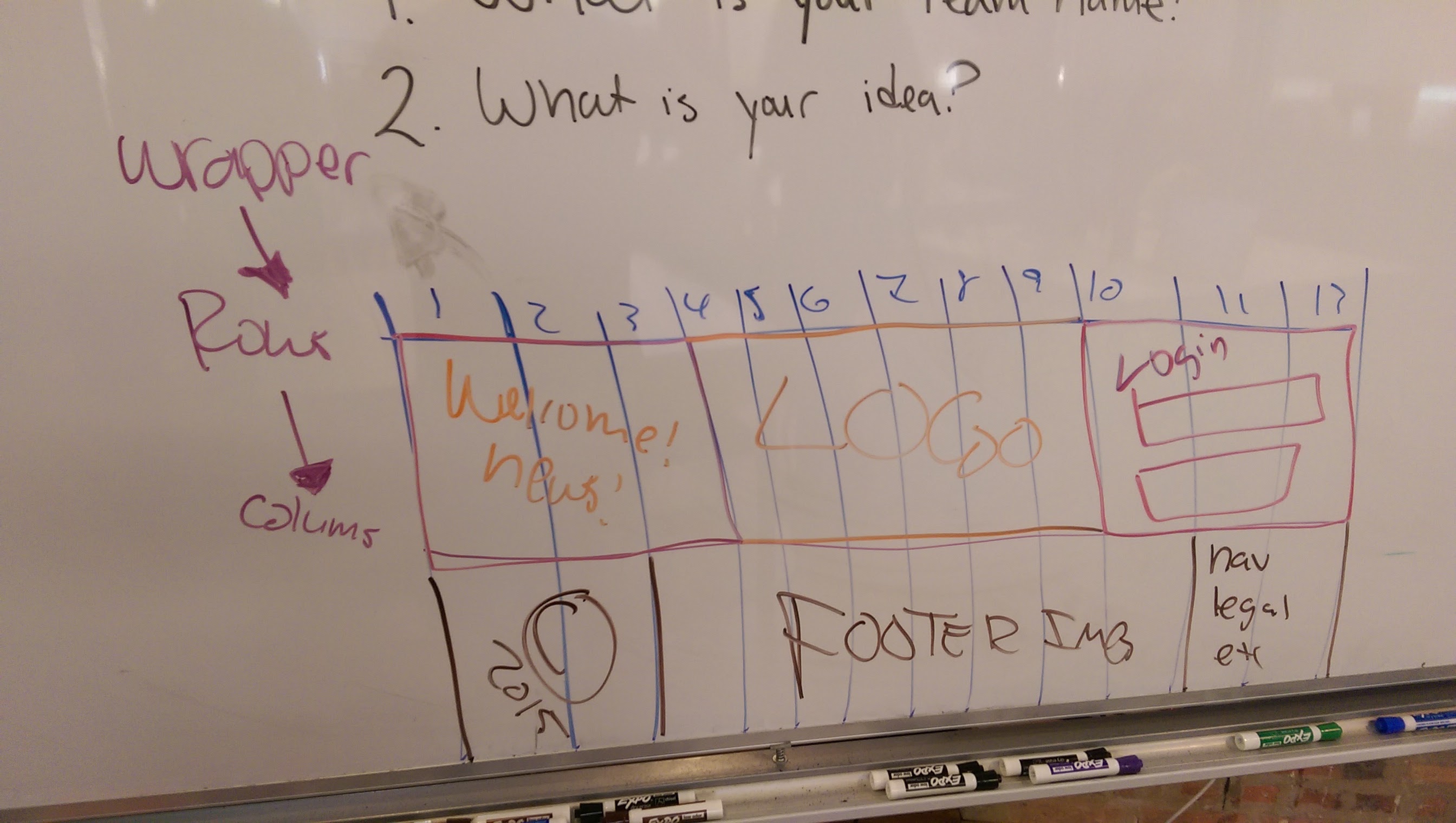
Exercise
- On Graph paper, create a 12 x 6 grid with a landscape orientation
- Place
header,nav,article,aside,footertags and more - Understand the class naming system of Bootstrap for columns
col-md-xwherexis a value of1through12for the grid.- 12 grids are placed inside of a row that live inside of
containers orwrappers.
Boilerplate
<section class='section'>
  <article class='row'>
    <div class='col-md-3'>3</div>
    <div class='col-md-6'>6</div>
    <div class='col-md-3'>3</div>
  </article>
</section>
Columns must add up to 12!